Leading an initiative to create a public-facing home for the CircleCI brand. From design principles to content guidelines, the brand site serves as an accessible source of truth for both employees and press contacts.
Skills in use Collaborators
Design Visual Design team
Research Marketing team
Illustration Corporate Comms team
Information Architecture
Project Management
Context
In 2021, the visual design team at CircleCI refreshed our brand to better serve and engage our audience of developers. Following the rebrand, we created a brand book primarily tailored for use within the design team. However, we identified a need for a further-reaching solution that would make brand expression simple & delightful for employees across the CircleCI org, as well as the press. I took on a lead role in this project, in collaboration with another design colleague and the director of corporate communications.
Problem
Initially, the visual design team shared brand guidelines via slides — this made it difficult for employees to discern if they were looking at an up-to-date version. Due to the version disparity, old guidelines were circulated, leading to inconsistent brand expression.
In addition, any changes to the press section of the CircleCI website had to go through our sole web developer (whose time, as one might imagine, was a very limited resource), creating in a bottleneck in communications.
User Personas
In order for our solution to be both successful and scaleable, it would need to accomodate a spectrum of user types:
» Internal vs. External: We needed to consider the needs of both our internal audience — CircleCI employees — and our external audience — press contacts looking for stats & boilerplate, or partner orgs looking to use the correct CircleCI branding.
» New hire vs. tenured employee: We anticipated that new hires would use brand resources in an exploratory way, while longer-term employees would likely be looking for something specific.
» Role within the company: Beyond the most obvious use cases within design and marketing, I wanted to explore ways our solution could extend to reach various roles. How might this resource make life simpler for someone on the People team? In the Engineering organization?
Constraints & Criteria
After facilitating discussions with our stakeholders across design, web, marketing, and corporate communications, I distilled constraints and success criteria. Our solution must:
» Show the right version of the guidelines to everyone, every time.
» Work well for both internal and external audiences, while allowing us to have some gated employee-only content.
» Encourage users to explore if they want to, but empower task-oriented users to quickly find what they need.
» Make it simple for both designers and the content team to update, without requiring dedicated engineering lift.
Based on the success criteria, we proposed that a publicly-accessible brand website would be the most robust, scaleable solution. Since limited developer resourcing was a constraint, we determined we would need to use a design system management tool as a base, instead of building the site from scratch.
To launch the site within the two-month timeline set by our stakeholders, my co-lead and I quickly set to work testing a broad swath of potential platforms. We facilitated weekly workshops with the visual design and content teams to create POCs for each platform, evaluate ease-of-use, and weight features in terms of priority in order to ensure we were moving forward with the right tool for our users.

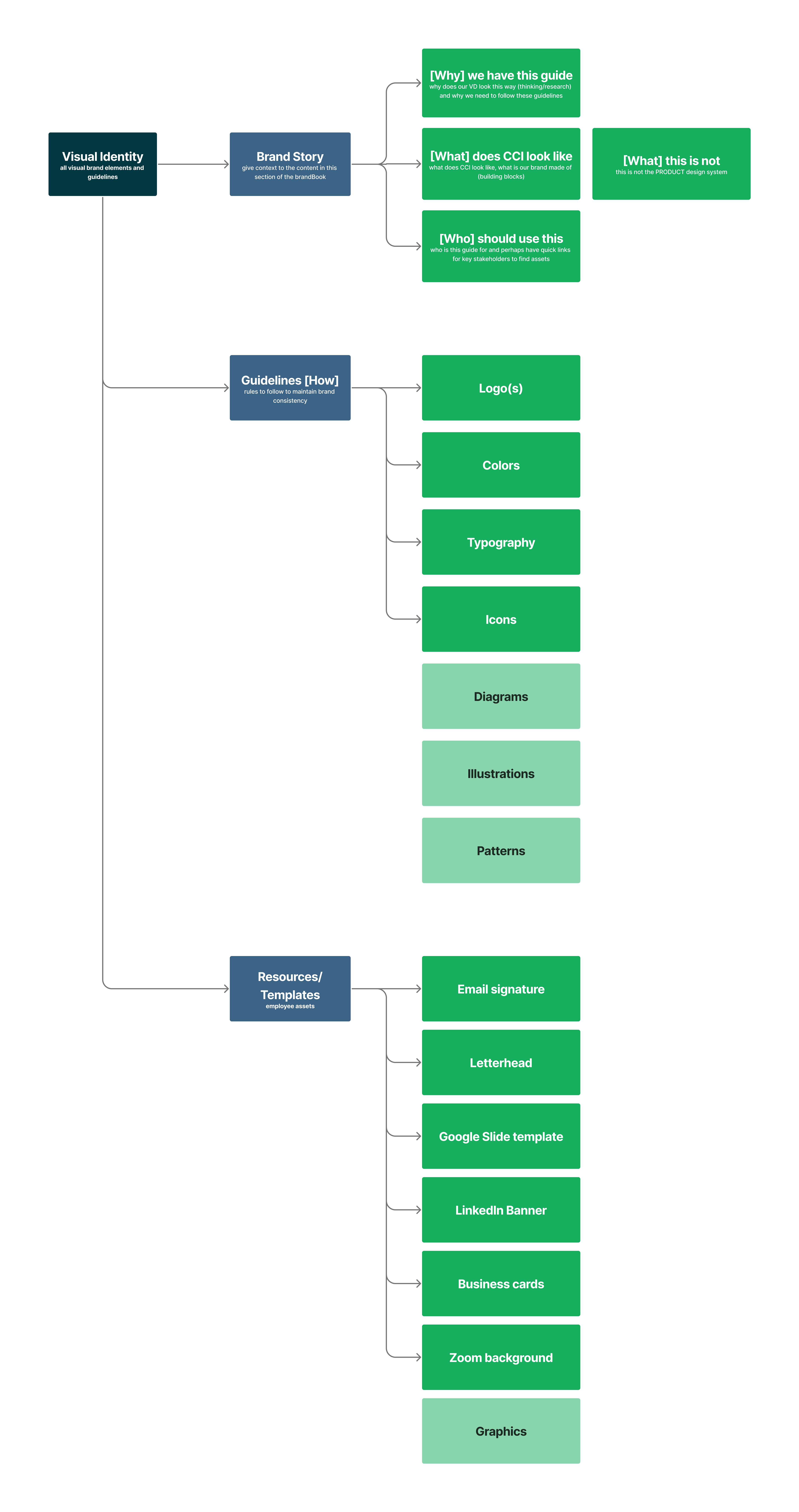
After choosing a hosting platform, we began building the site. I facilitated a card sorting workshop with a cross-org group of colleagues to determine an information architecture that would work for our internal users in a variety of roles.
Based on the findings of the card sorting workshop, my co-lead and I adjusted our approach to the IA, defined the sitemap, and began to write and design the content.


To deliver the project as quickly as possible, I worked with the director of communications to set up a phased rollout plan based on potential impact of the content. We launched an MVP with the core pages ahead of schedule, and used the phased rollout as an opportunity to generate excitement around new content.


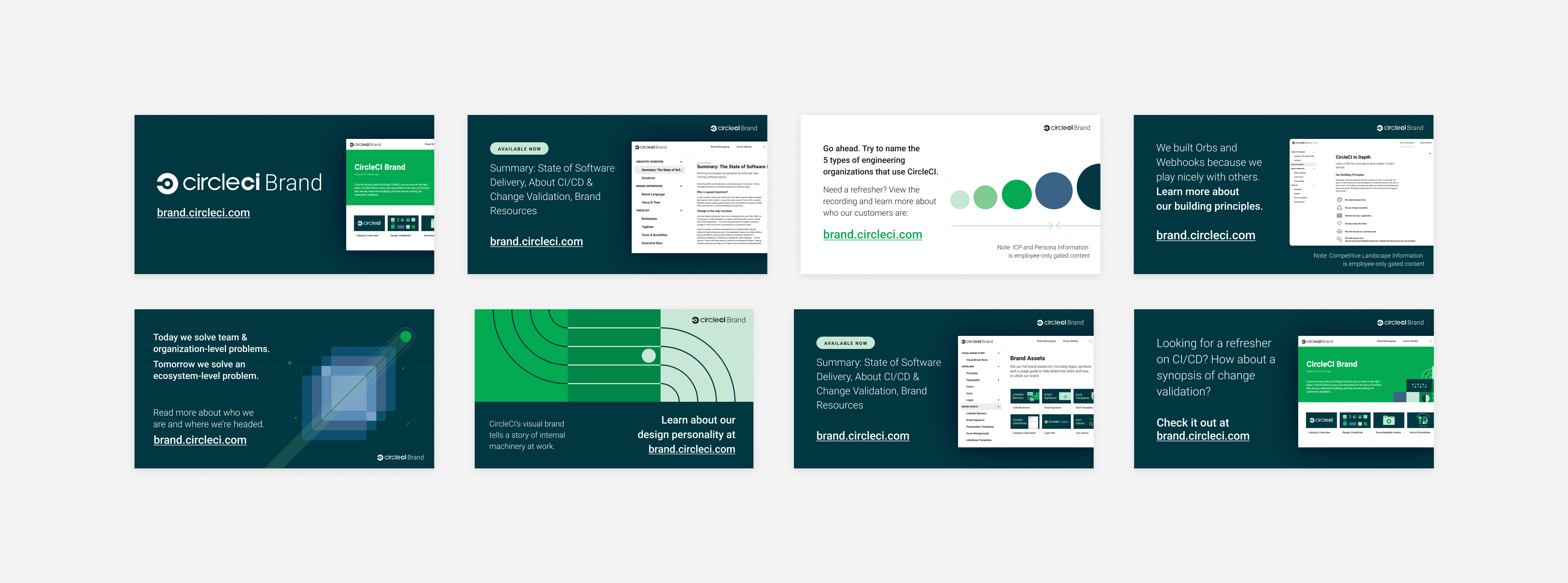
The next step after finalizing the IA, design, and content was to raise awareness within the company — to make it known, and make it matter to people. I created a series of graphics and illustrations that were woven into presentations and company Slack communications, providing both visual interest and 'information scent' to drive engagement.


Outcomes:
After the launch and promotion campaign for the brand site, we measured both qualitative and quantitative impact metrics. The design team saw a decrease in requests for assets like logos and icons corresponding to metrics showing self-serve downloads of these assets from the site. Colleagues across the org — in engineering, product, marketing, people ops, and sales — linked to the site in response to "where can I find [X]?" messages in Slack channels.
In addition, following our release of the Mission & Vision materials on brand.circleci.com, employee engagement survey data showed a 12% QoQ improvement in sentiment around understanding CircleCI's vision and future strategy. Although I'm hesitant to suggest causation in this case, the brand site was a major element of the campaign to improve this metric.
Learnings:
The primary point of friction within this project came from mismatched understanding of requirements and timeline between design and our stakeholders. In retrospect, I think we could have mitigated this by asking specific questions early on to understand the pressure from above the stakeholders that was motivating the time crunch.
Another area for improvement — the methodological rigor of the card-sort workshop I facilitated. I opted for a lightweight, informal method due to time constraints, but I believe the data would have been more representative had I used a different tool (that allows for an anonymous sorting per participant), and been able to bring in a larger pool of participants.

