Branding and identity for a virtual convention bringing together caregivers and child care providers throughout California.
Skills in use Collaborators
Branding M. Kristjansson:
Identity Communications Director
Context
Every three years, United Domestic Workers (UDW) hosts a convention where home care and child care providers can gather to hear from inspiring speakers, vote on resolutions to the UDW constitution, and connect with fellow care workers.
Approach
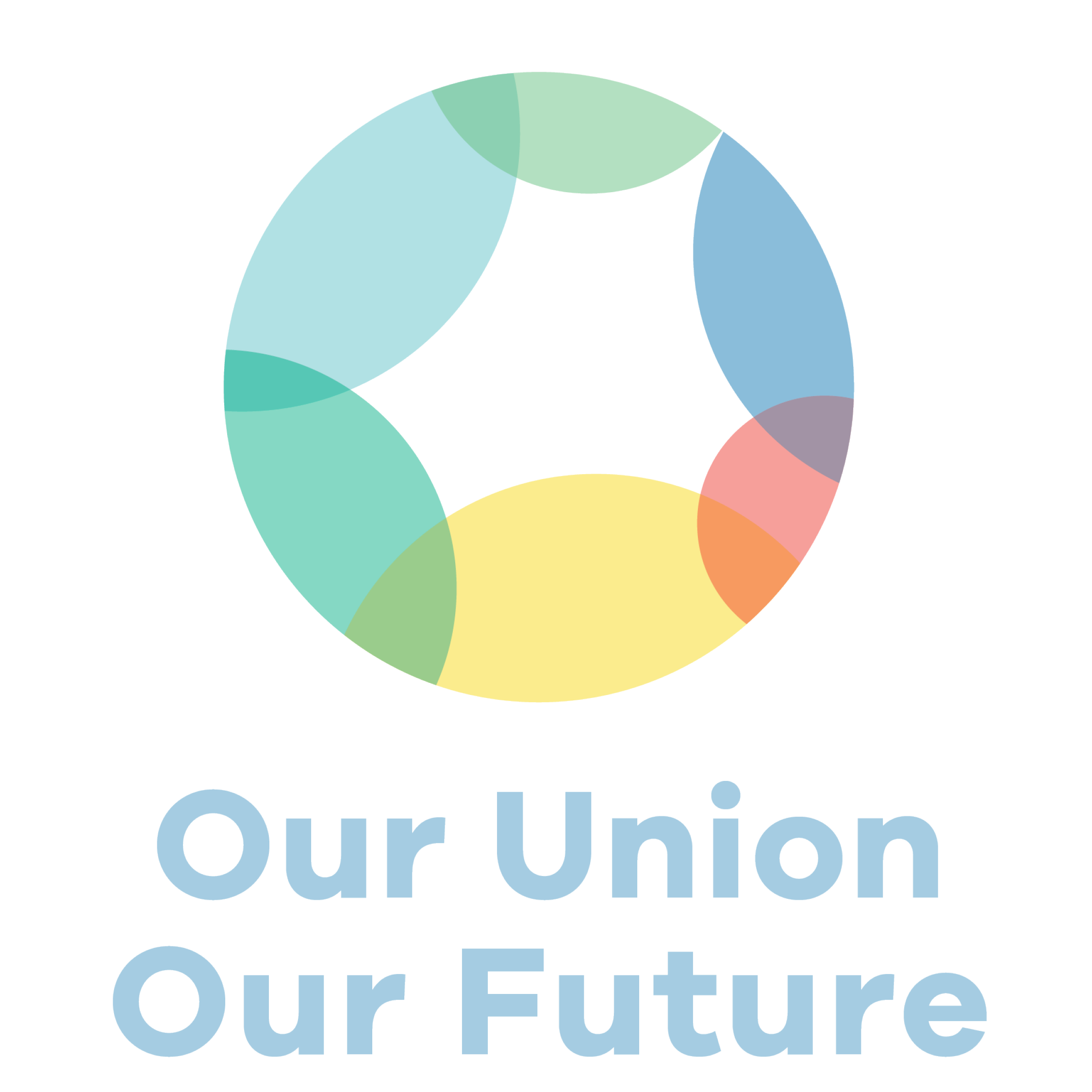
The communications team at UDW came up with several convention themes, eventually landing on three that we would present to the Executive Board: Our Union Our Future, Here for Each Other, and Empowering Essential Workers. For each of these themes, I created nine preliminary logos for a total of 27 options in the initial round. From there, our team refined it down to six options for me to present to the Board. I tried to express a wide aesthetic range across the seven options.
For many of these options, including the one that was finally chosen, I wanted to express themes of unity and hope. Because this is the first convention following the introduction of child care providers into the union, I chose to integrate yellow, which UDW uses to represent child care, with blue and green, which represent home care. The final logo combines a letter 'O' motif (for Our Union, Our Future) with smaller circles to symbolize wholeness.
Outcomes
In this preliminary stage, the brand identity has raised awareness and excitement around the convention—with both UDW members and the Board. As we approach the convention in August 2021, the branding will guide the visual direction of the convention website, app, merch, and printed materials. Stay tuned for what's to come!
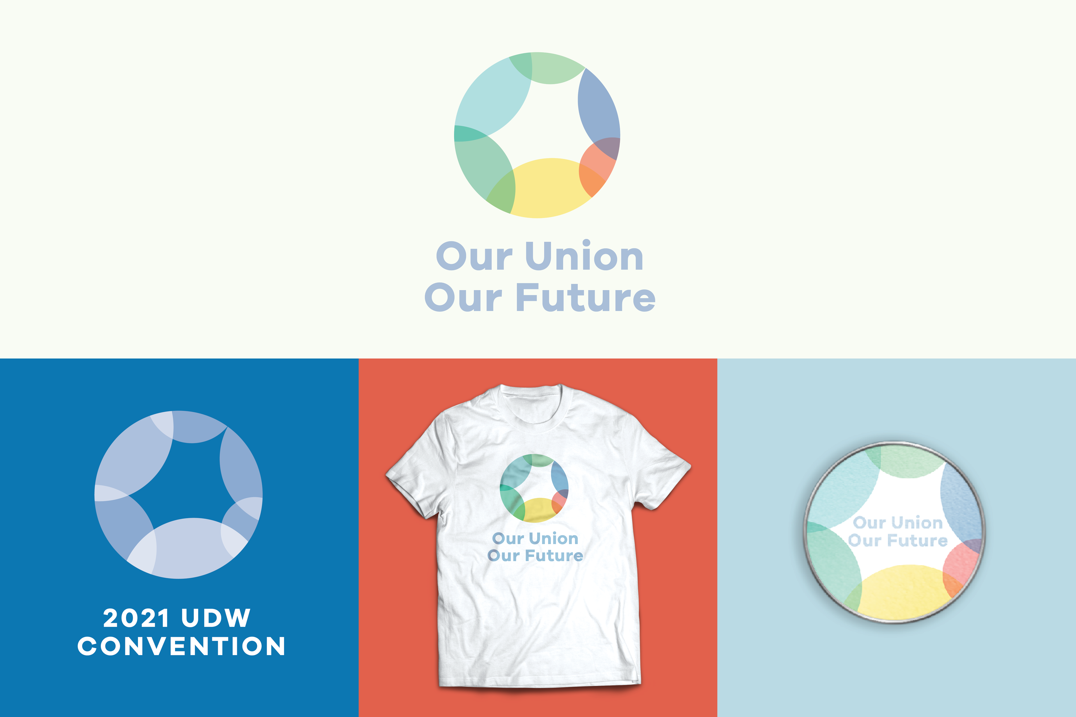
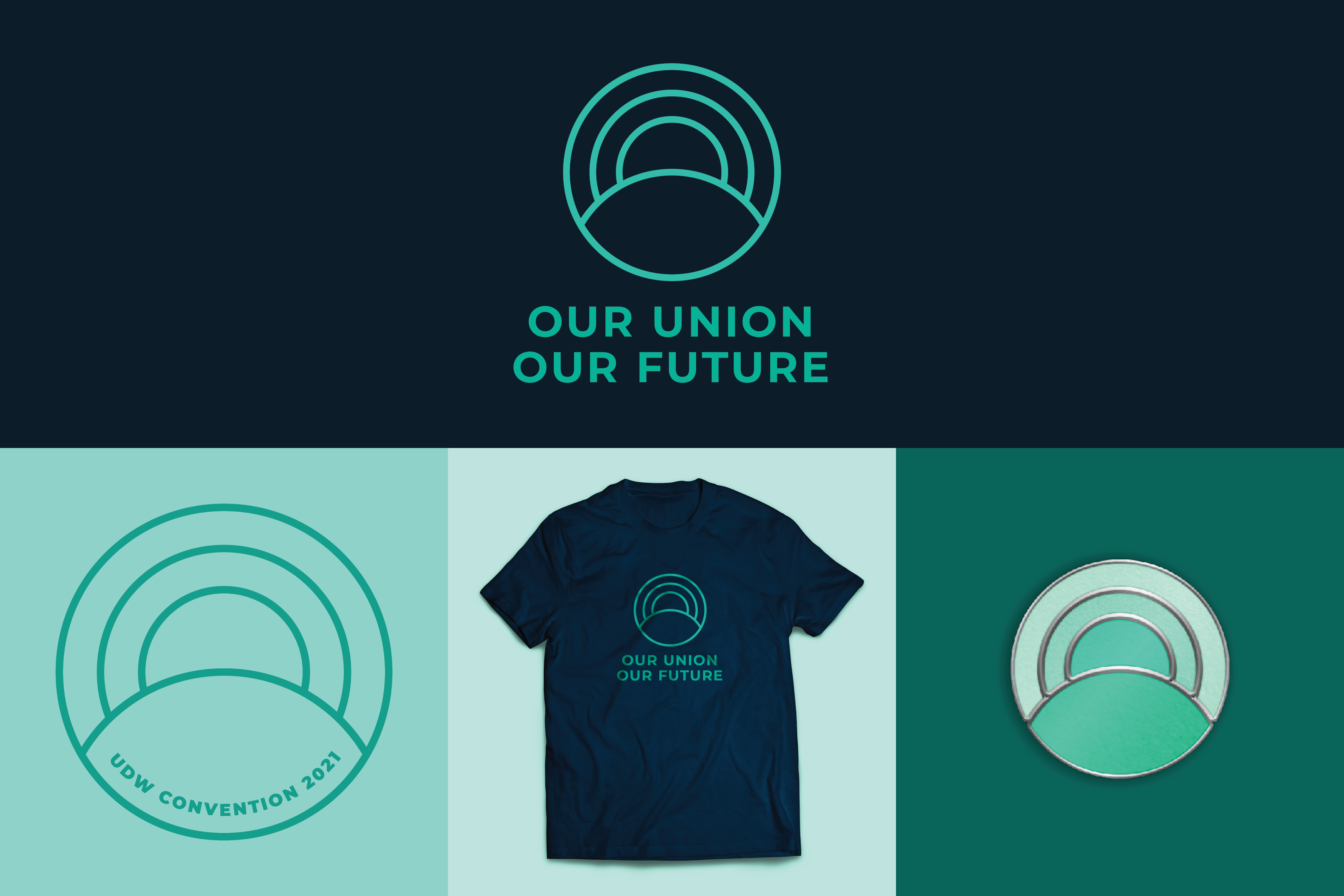
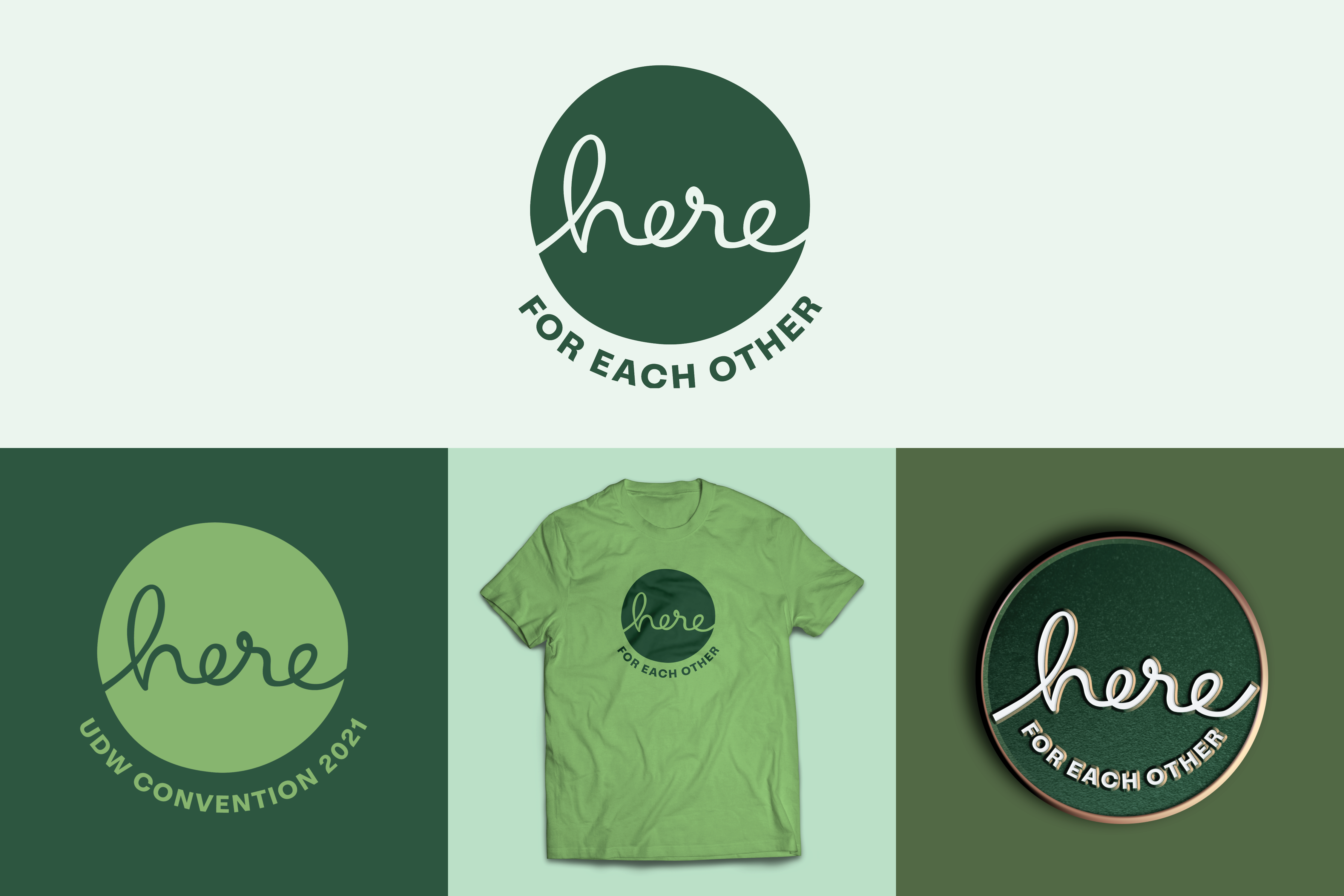
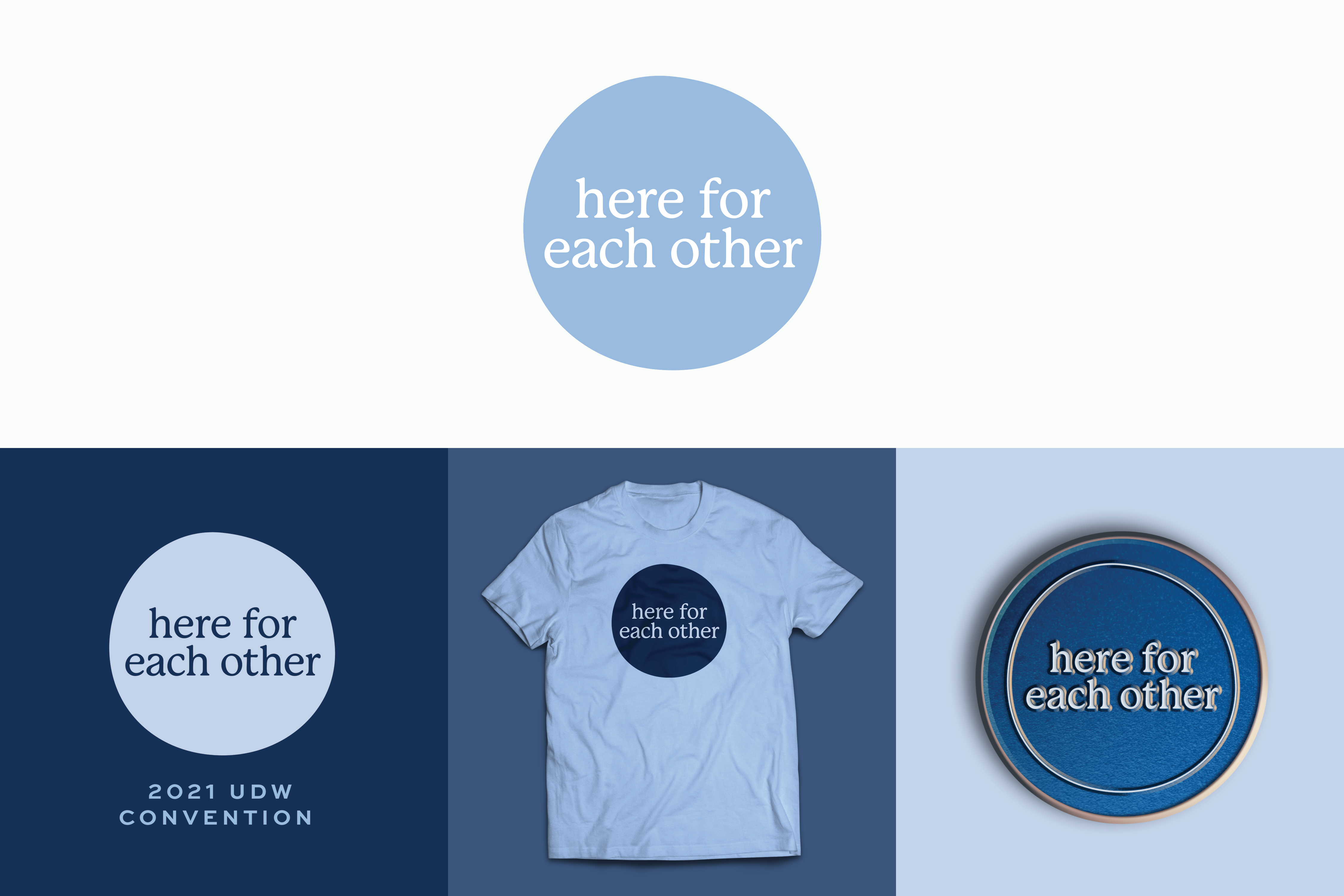
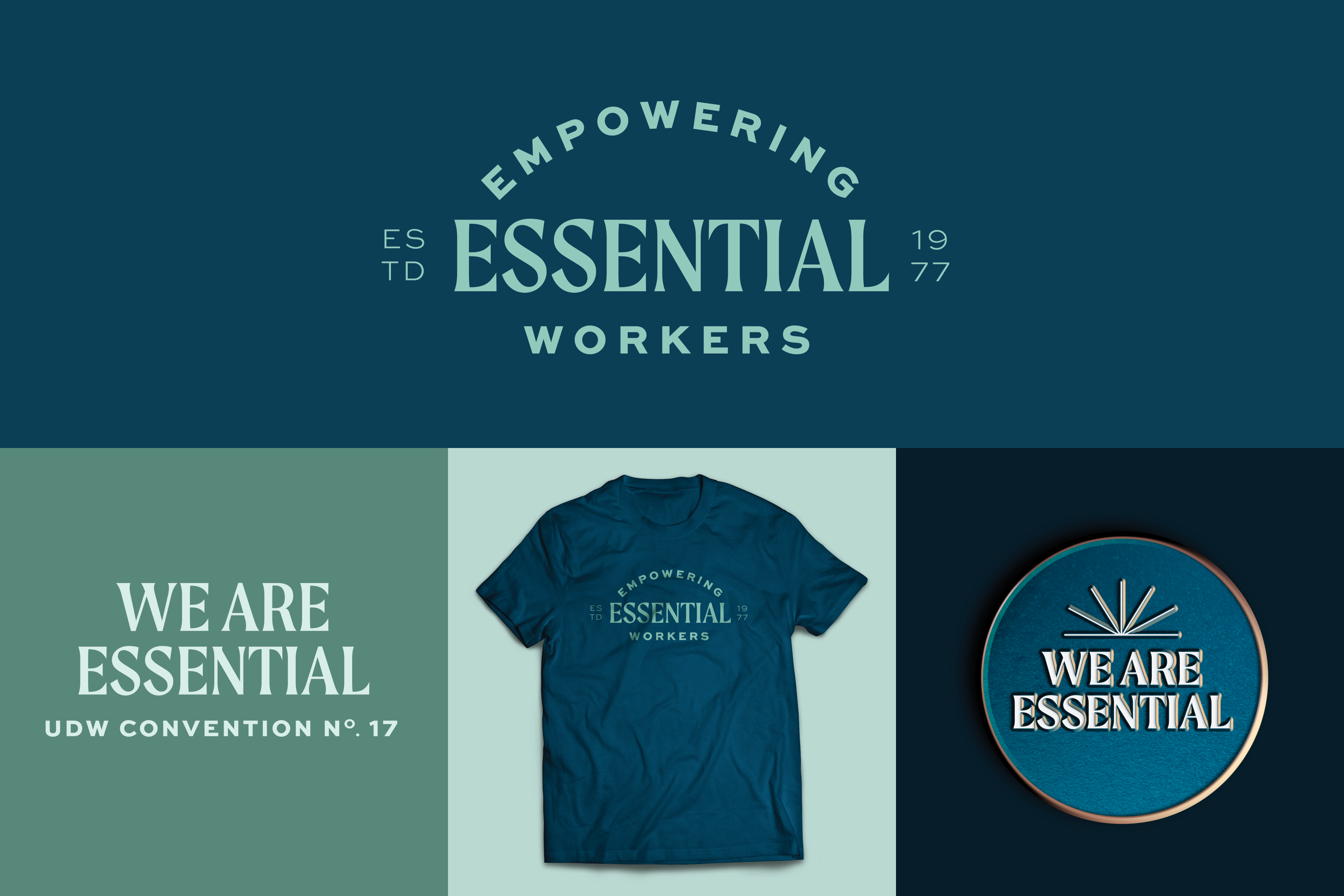
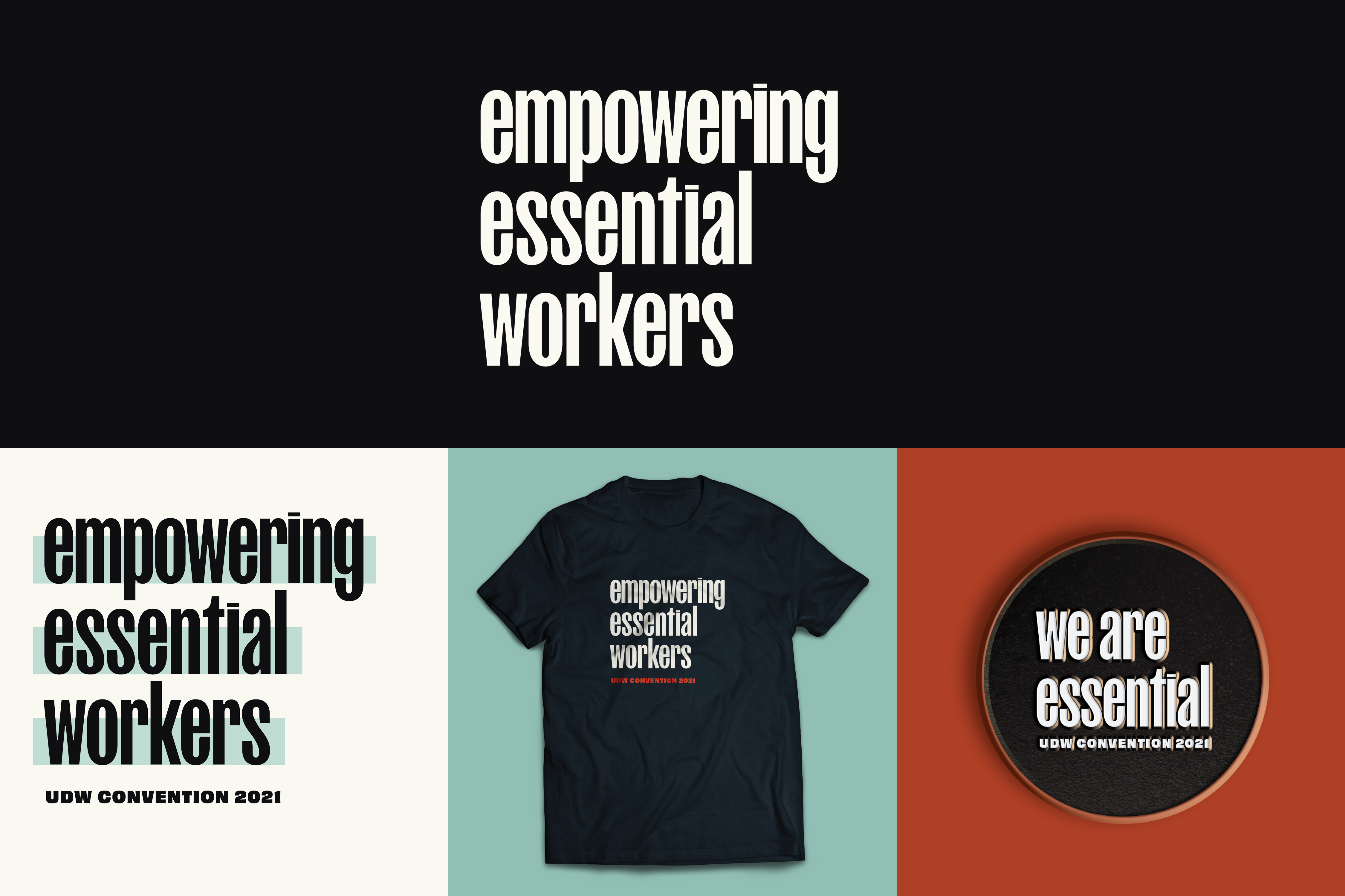
Collected brand boards from the presentation to the Executive Board. The first "Our Union, Our Future" iteration was the board's outspoken favorite.
© 2021 Khaleelah Elhajoui | All Rights Reserved