Website design and content strategy for a union representing over 140,000 care workers throughout California. The new interface fulfills top-level goals: increasing visual unity, reducing friction, and improving user experience.
Skills in use Collaborators
Design M. Kristjansson:
Research Communications Director
Content strategy D. Arel:
Writing Digital Strategist
C. Parker:
Staff Writer
J. Kleiner:
Developer
Context
In 2020, UDW achieved one of the largest organizing victories in recent U.S. history, adding 15,000 child care providers to the workers they represent. During the pandemic, UDW members have seen new levels of public awareness around their life-saving work—legislators, news sources, and high-profile activists have recognized the critical role of in-home care and child care in addressing long-term care and early childhood education crises that face California. In light of their new growth, the organization initiated a website redesign that would feel fresh and inclusive to everyone in their evolving membership base.
Problem
In the previous version of UDW's site, many of the most important resources are buried in pages that are difficult to find, while outdated information surfaces at the top. Throughout the site, information was formatted inefficiently, forcing users to dig through long bulleted lists in order to find what pertains to them. In addition, the site was heavily oriented toward home care providers and the inclusion of the newly-organized child care workforce felt like an afterthought. I needed to create a simpler and more inclusive experience.
Approach
At the onset, I evaluated the website through the lens of different types of value it might provide to users. Based on conversations with users, our team distilled three primary elements of value that we would optimize the site to provide:
» Access: Membership at UDW allows care workers to access benefits like free community college, direct connections to the legislators who determine policy around IHSS and child care, and experts who can advocate for them and their clients.
» Information: UDW’s website is one of the few cohesive resources where In-Home Supportive Services (IHSS) providers and state-subsidized child care providers can access current information—in plain language and in one place.
» Affiliation and belonging: Home care and family child care providers are often isolated due to the nature of their home-based work. Being part of UDW creates opportunities to build community with fellow care workers.
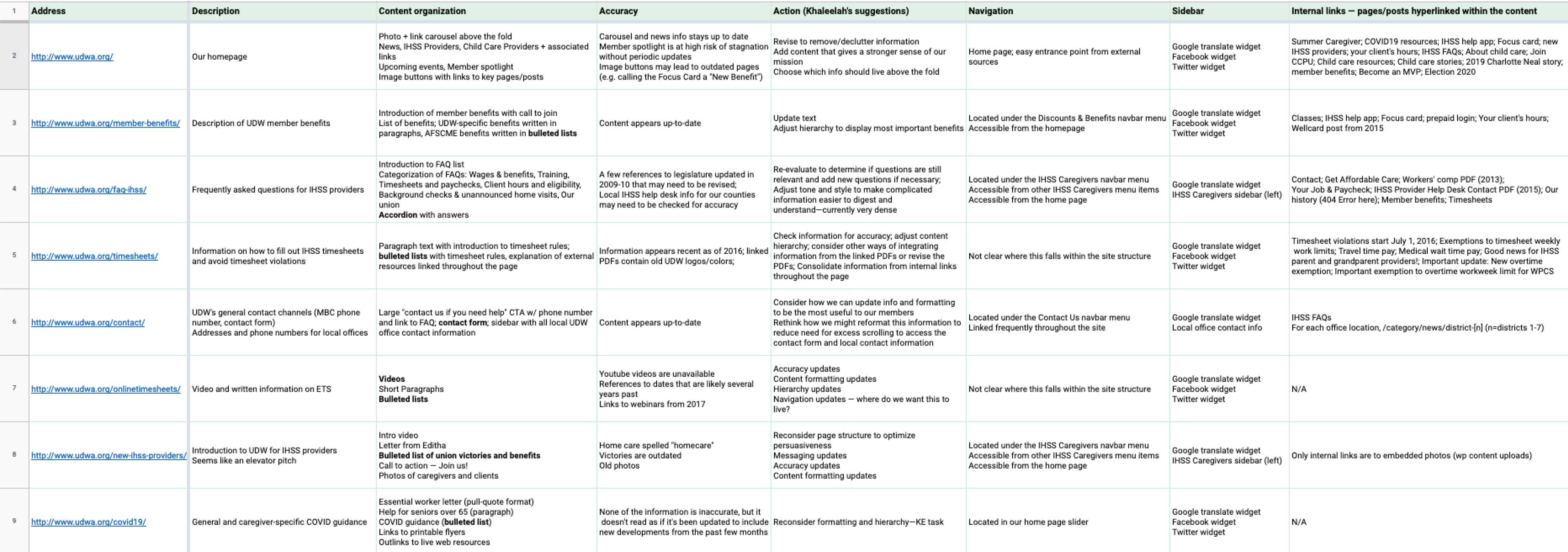
With those three tenets in mind, I conducted a content audit of the current website in order to clarify the relationships between pages, reduce clutter, and elevate the information that users really need.
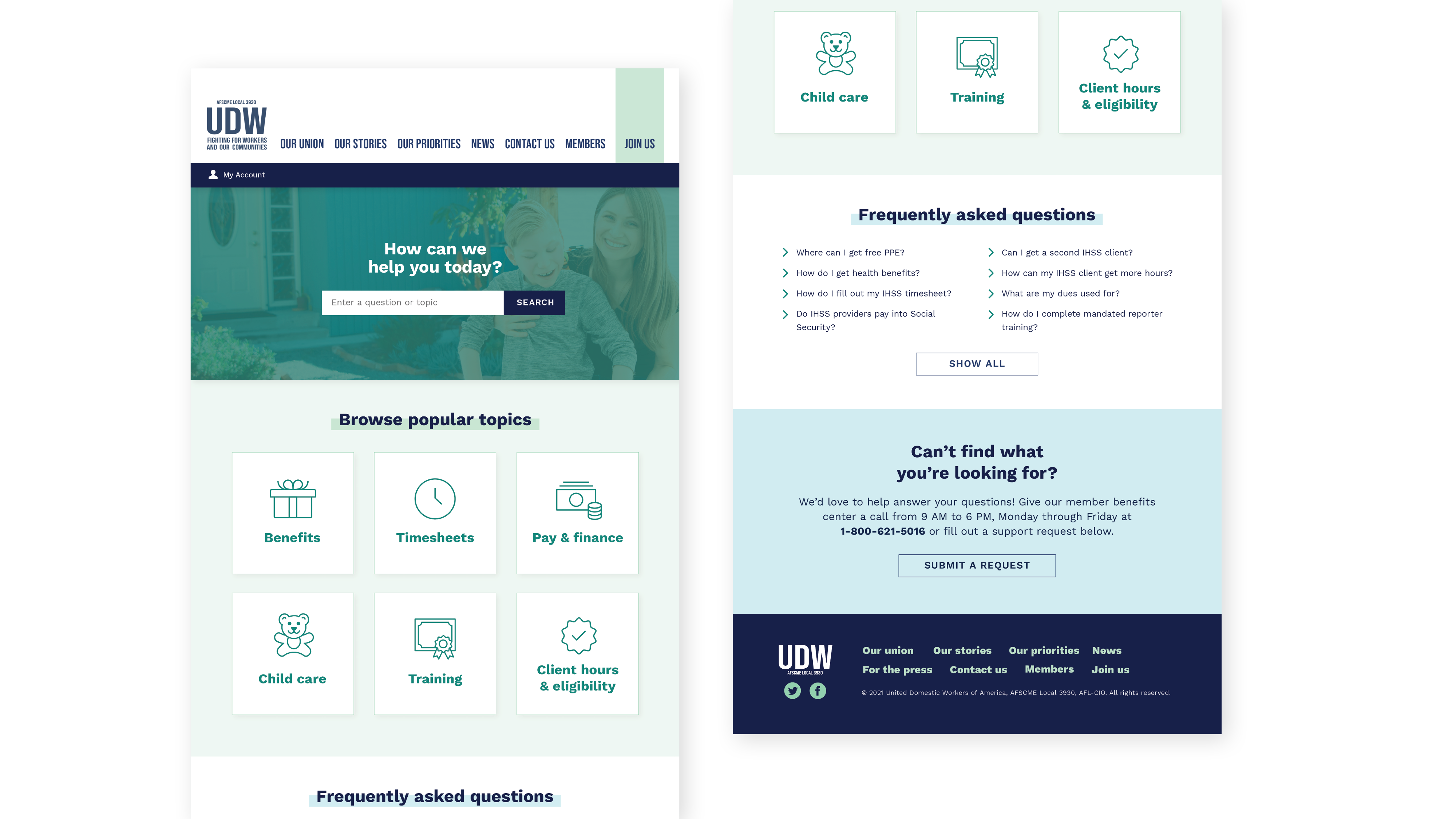
I collected my qualitative findings with analytics and found that users primarily browsed the site as an information source, but kept ending up at the same few outdated pages. This discovery led me to introduce a page that didn't exist before — an interactive help center that will serve as a members-only benefit. You can view my full content audit here.
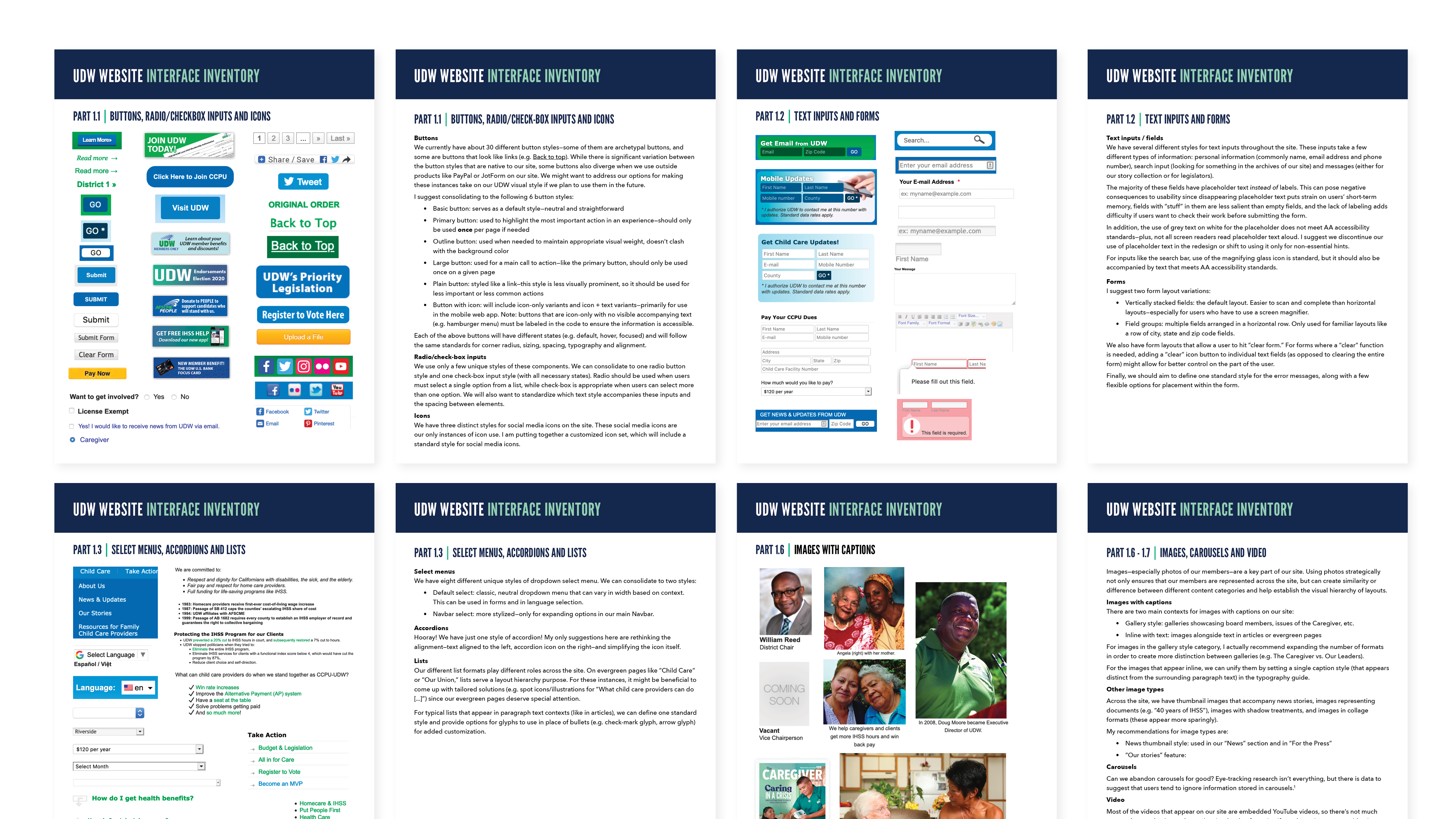
To improve visual consistency across the site, I knew it would be necessary to create a design system. As a first step, I took an inventory of every unique component — from select menus to error messages — on the current site and provided written analysis to identify redundancies and unmet needs. I found abundant opportunities to consolidate component styles, which I address in the new interface. The inventory also revealed a need for more robust filter options and methods for selectively displaying information. The current interface relies on dense, text-heavy formats for content that would be much easier to scan if compartmentalized.
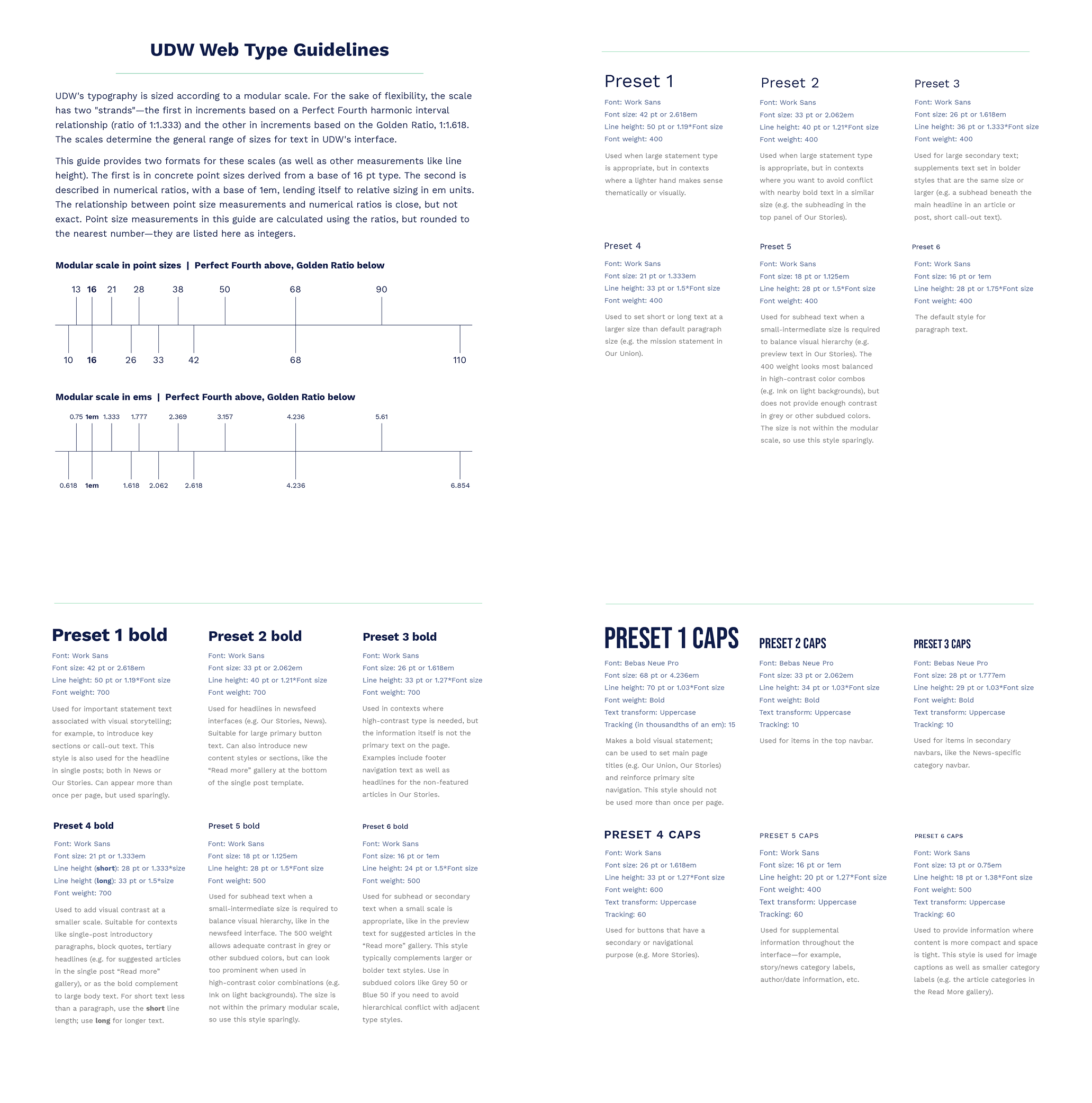
Using insights from the interface inventory, I created guidelines to ensure a more consistent experience across the site. I built the typography system around a modular scale with two "strands" — the first in increments based on a ratio of 1:1.333 and the other on a ratio of 1:1.618.
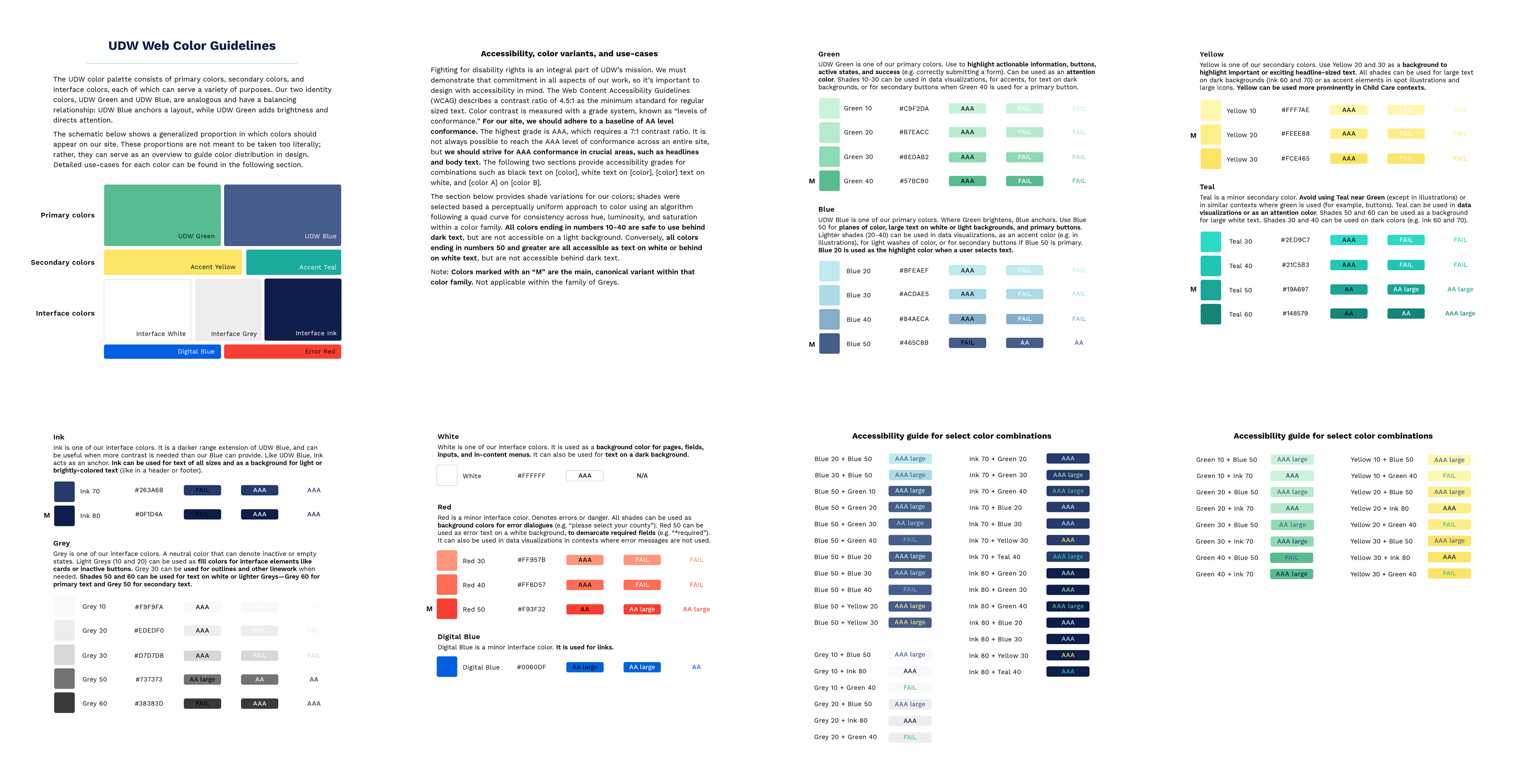
For the color system, I introduced a perceptually uniform approach to color to achieve consistency across hue and saturation within a color family. I also took the opportunity to set up conventions that make it easier to pick accessible color combinations by integrating levels of contrast into the naming system. All colors ending in numbers 10-40 are WCAG safe to use behind dark text, but are not accessible on a light background. Conversely, all colors ending in numbers 50 and greater are accessible on white, but cannot be placed on a dark background.
Currently, I'm working on the library of interface components, as well as a set of custom icons that will also have a home in the design system.
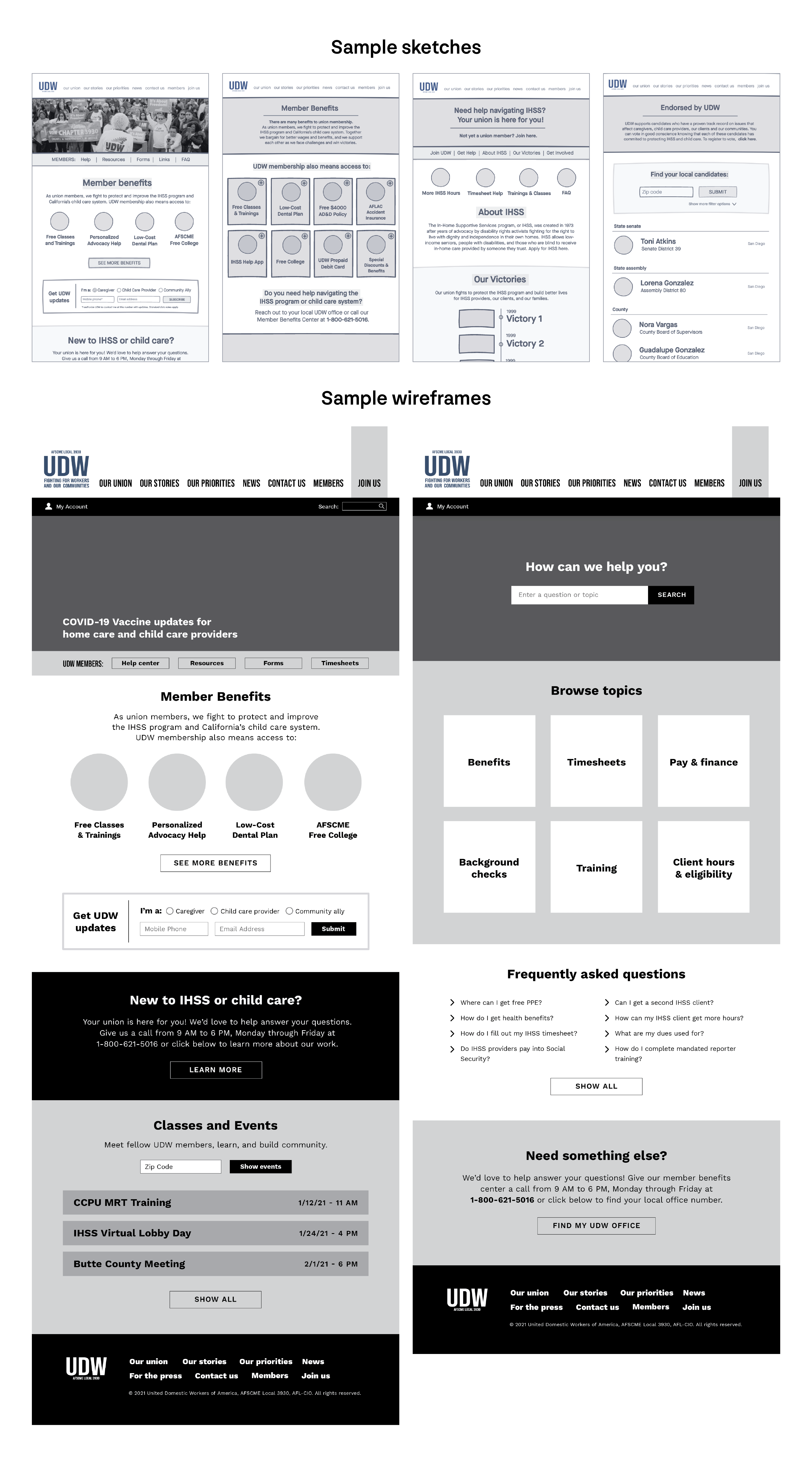
Once I had established guidelines for the visual style, I moved to developing sketches and wireframes. After creating mid-fidelity wireframes for the site, I conducted usability interviews with UDW members in which they responded to three different scenarios:
1. You need to find help with your UDW benefits. Show me how you would browse to find it.
2. Show me how you would look for a list of training opportunities.
3. Show me how you would ask about a resource that you couldn’t find on the site.
The interviews found that overall, users were able to easily navigate the website and find information and resources related to in-home care. However, the child care providers we tested didn’t know where their questions fit into the new help center design. A few participants wanted an option to add classes and trainings directly to their calendars. Participants also faced some confusion around how to call and ask questions—should they call the member benefits center or would their local office be better?
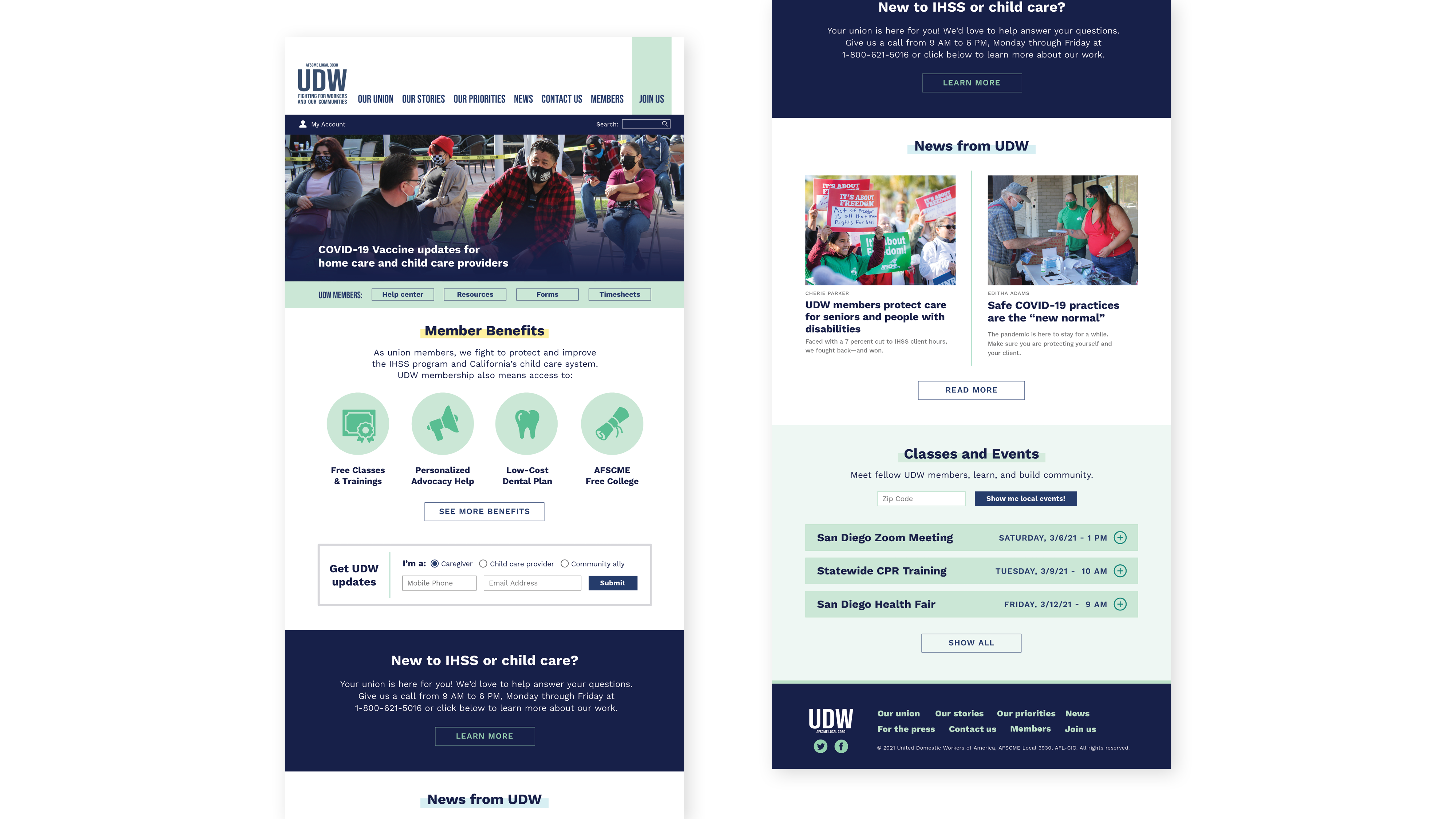
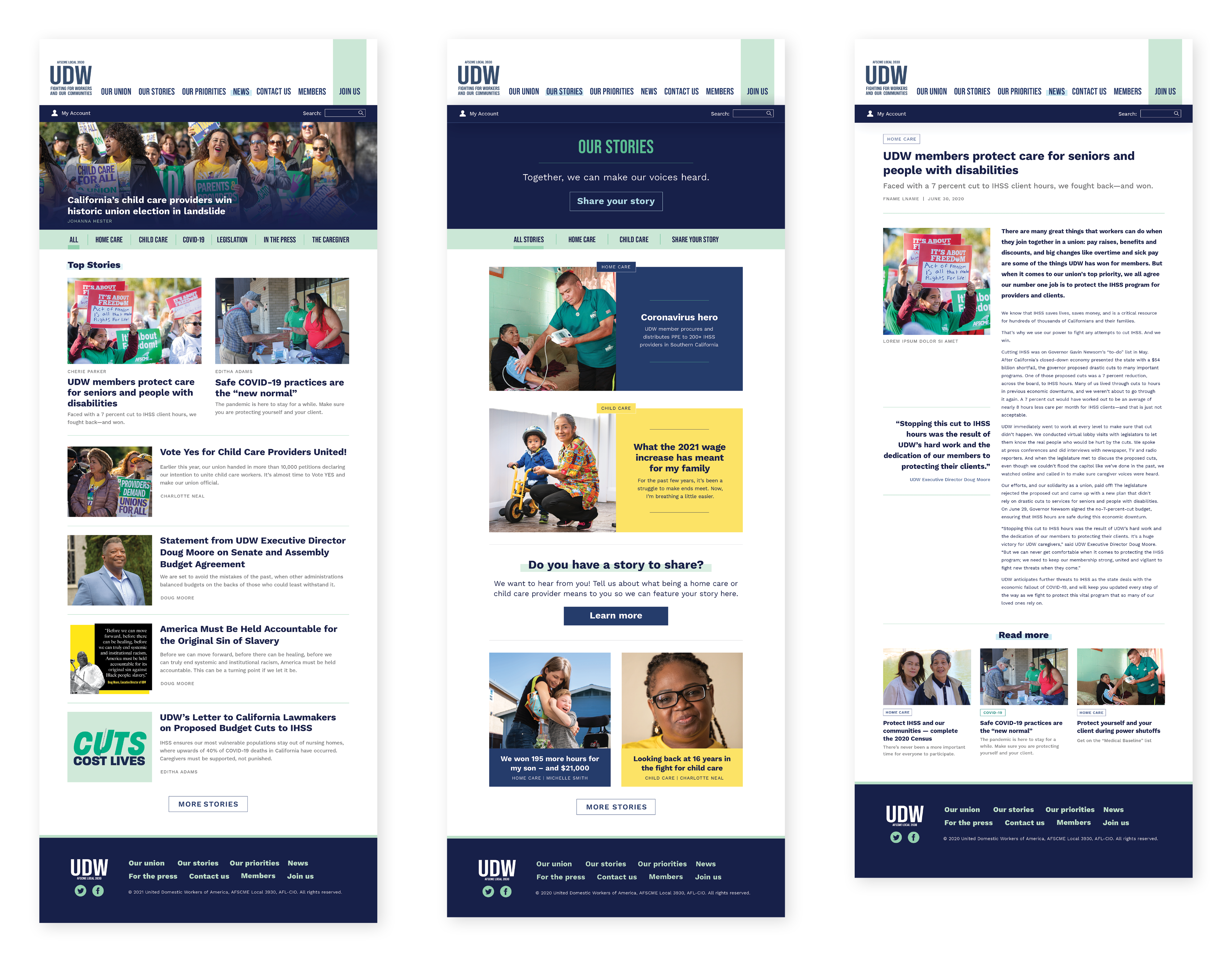
As I integrated the user feedback into high-fidelity mockups, I also brought in a few updates that might increase engagement and story sharing. Previously, the site used the same feed style for both the news page and the member stories page. By creating a more photo-centric style and increasing the visibility of the "share your story" dialog on the member stories page, I was able to add contrast between the two different newsfeed types and make the member stories page more inviting.
While there is still work to do before the project launches in August 2021, our team has already made strides in improving the user experience. In the next phase, I look forward to finalizing the design system and introducing additional user testing with high-fidelity prototypes.
© 2021 Khaleelah Elhajoui | All Rights Reserved
